Data Visualization
Visualization is a potent way to tell a story with your data.
W.E.B. Du Bois’ data portraits included in the the Exhibit of American Negroes at the Paris Exhibition of 1900 illustrate the power of effective visualization. With compelling hand-drawn graphics, Du Bois tells the story of what it means to be Black in post-Emancipation America as he translates sociological research and census data to reach beyond the academy. On the arts website Hyperallergic, Jasmine Weber has described “How W.E.B. Du Bois Meticulously Visualized 20th-Century Black America.”
Different types of visualization work best for different types of analysis. The table below, reproduced with minor modifications from the CUNY DHRI-Curriculum GitHub repository “Data Literacies,” (licensed CC-BY-SA), offers some examples.
| Type of Analysis | Type of Visualization | When to Use | Example of Visualization |
|---|---|---|---|
| Comparison | Bar chart | Comparison across distinct categories | 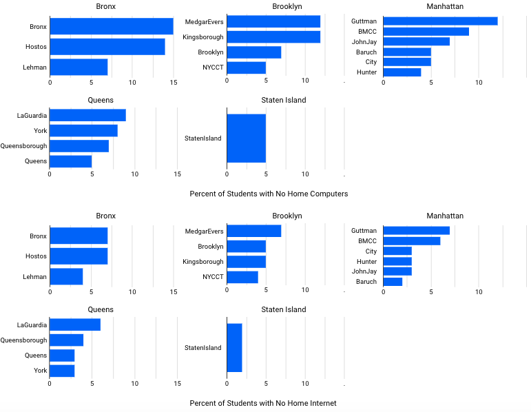 |
| Histogram | Comparison across continuous variable | 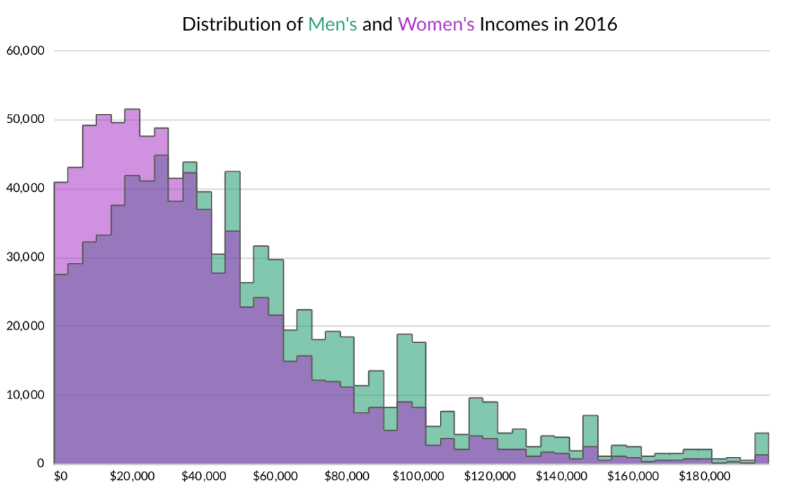 | |
| Scatter plot | Useful to check for correlation (not causation!) | 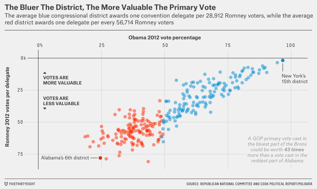 | |
| Time | Stacked area chart | Evolution of value across different groups | 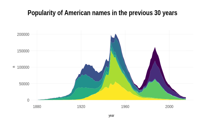 |
| Sankey Diagram | Displaying flows of changes | 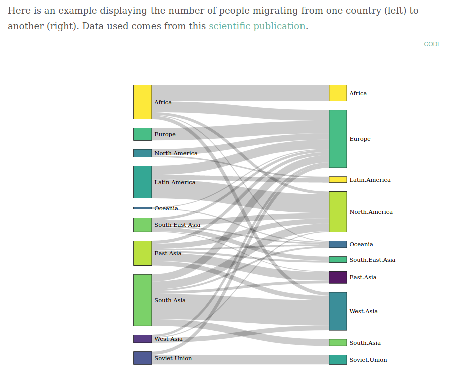 | |
| Line graph | Tracking changes over time | 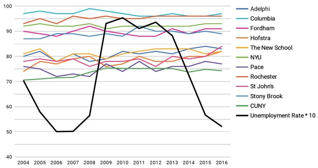 | |
| Small numbers/percentages | Pie chart | Demonstrate proportions between categories | 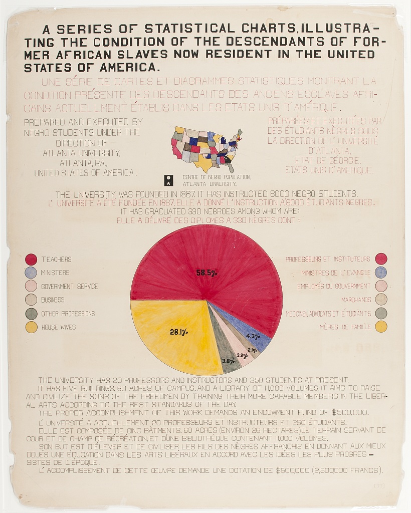 |
| Tree map | Demonstrate hierarchy and proportion | 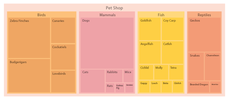 | |
| Survey responses | Stacked bar chart | Compares total amount across each group (e.g. plotting Likert scale) | 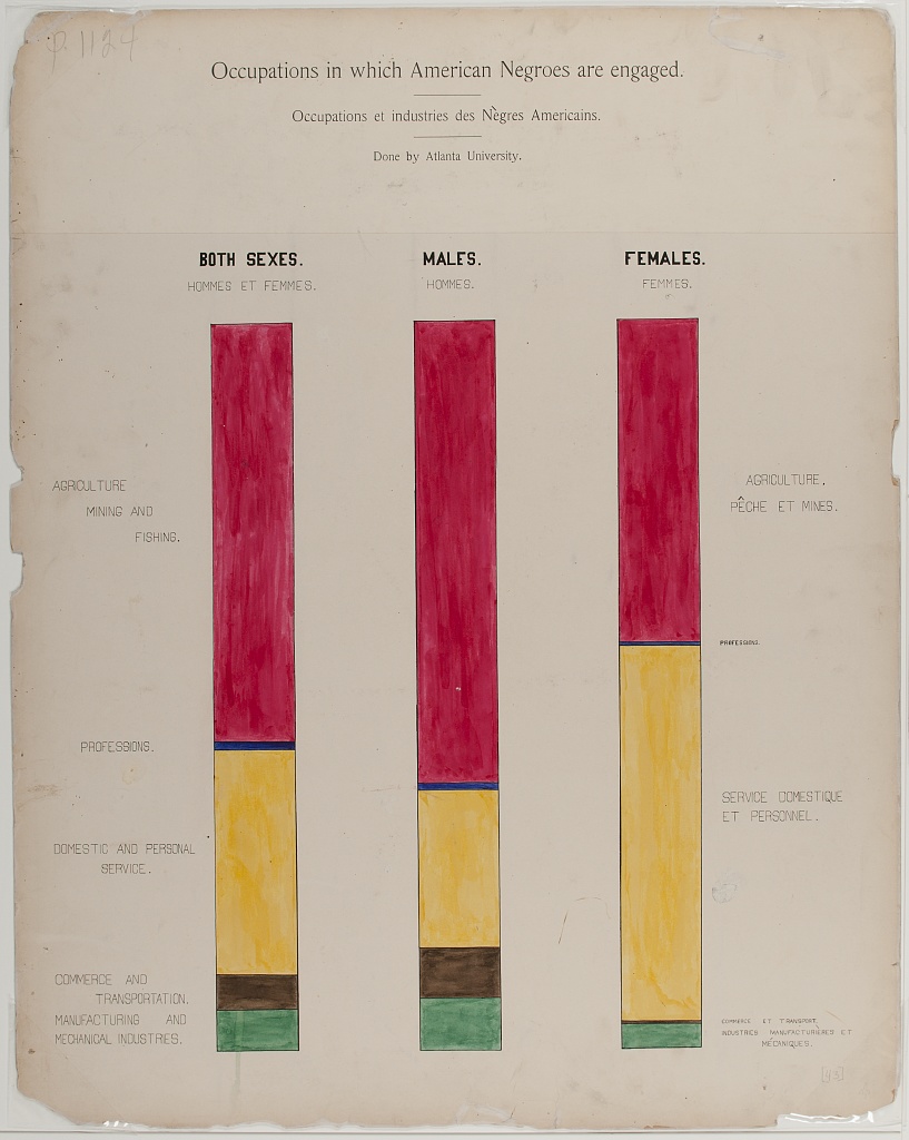 |
| Nested area graph | Visualize branching/nested questions |  | |
| Place | Choropleth map | Visualize values over a geographic area to demonstrate pattern |  |
| Hex(bin) or Tile map | Similar to Choropleth with the hexbin/tile representing regions equally rather than by geographic size | 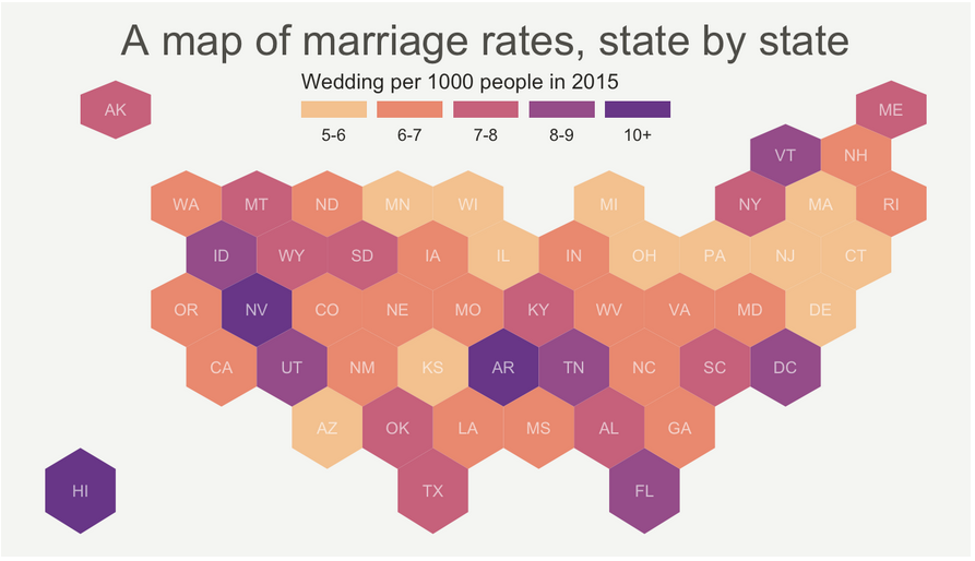 | |
| Adapted from Stephanie D. Evergreen (2019) Effective data visualization: The right chart for the right data, The Data Visualization Catalogue, and From Data to Viz. | |||